


Enjoy the Drama of Autumnal Paint Tones
Autumn is all about hunkering down, getting cosy, and giving our homes that extra layer of warmth—and what better way to do it than with rich, dramatic paint tones? As the nights draw in and the festive season approaches, now’s the perfect time to tackle that long-awaited home refresh.
A Shift Towards Earthy Drama
Lately, there’s been a national shift in taste. According to Google, searches for “cosy colours” are up 80%, with more of us leaning into dark brown, red, and earthy tones. Say goodbye to the flat greys of the past—2024 is all about deeper, moodier hues that envelop a room and make a statement.
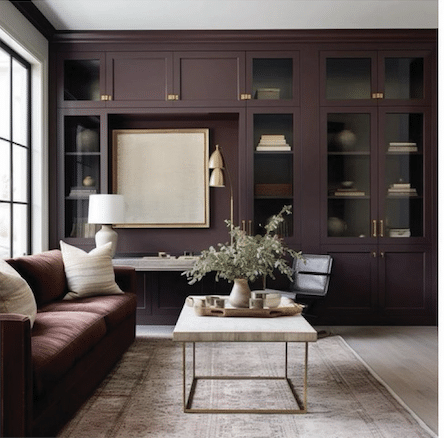
Think claret, oxblood, burgundy, and plum. These tones aren’t just for walls anymore—designers are using them for cabinetry, panelling, and even upholstery. If you’re going for drama, go all in. A feature wall drenched in colour can create a striking backdrop for your festive decor or art collection.
Not Just a Feature Wall
Don’t let modest-sized homes stop you. Rich colours can be stunning in smaller spaces. They bring intimacy, character, and a sense of warmth. Pairing a dark wall with soft lighting and warm-toned accessories is a winning combination.
And don’t feel confined to just the walls—kitchens, bathrooms, and even ceilings can benefit from this bold approach. Add a splash of colour to cabinetry or try it on your front door for instant kerb appeal.
Are Designer Paints Worth It?
One of the most common questions I get is: “Are designer paints really better?” In short—yes. Brands like Little Greene, Farrow & Ball, and Neptune offer high pigmentation, deeper colour payoff, and superior coverage. That means fewer coats, longer-lasting finishes, and less maintenance down the line.
Plus, their sophisticated tones often have unique undertones that mass-market paints just can’t replicate. Take “Peach” from the ’90s—today it’s rebranded as “Lick Pink 02” with a soft, warm undertone. Same spirit, but a modern feel.
Pairing for Impact
Not sure how to balance these intense shades? Try pairing burgundy or oxblood with olive green, mustard, blush pink, or powder blue. These lighter tones help lift the mood and keep things fresh. Add in brass or matte black hardware for a complete look.
If the drama isn’t quite your style, you can still nod to the trend with deep-toned accessories like cushions, throws, or kitchen accents.
Shauna’s Favourite Autumn Paint Picks
- Little Greene Paint & Paper – Claret
- Farrow & Ball – Brinjal
- Lick – Pink 02
- Neptune – Burnham Red
- Little Greene – Dark Lead Colour
Autumn is the perfect time to wrap your home in warmth. Whether you’re going bold on all four walls or simply freshening up with a splash of drama, rich autumn tones can transform your space into something truly special.
Happy decorating!
Shauna x